
Packaging
Top G Nutrition represents one of those enterprises that are challenging to initiate and operate. However, once you overcome the initial period of anxiety, it becomes a deeply fulfilling venture to engage in.
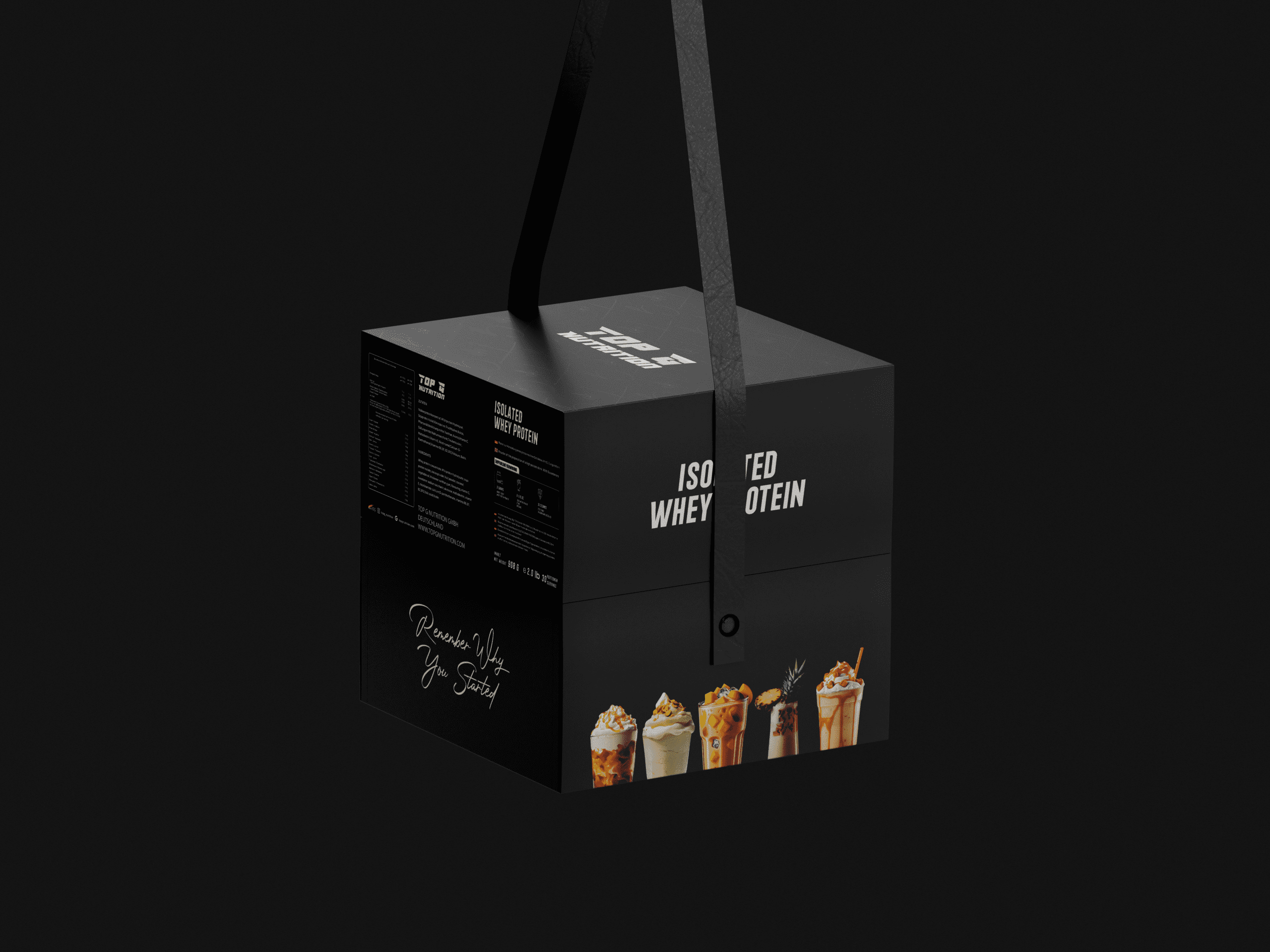
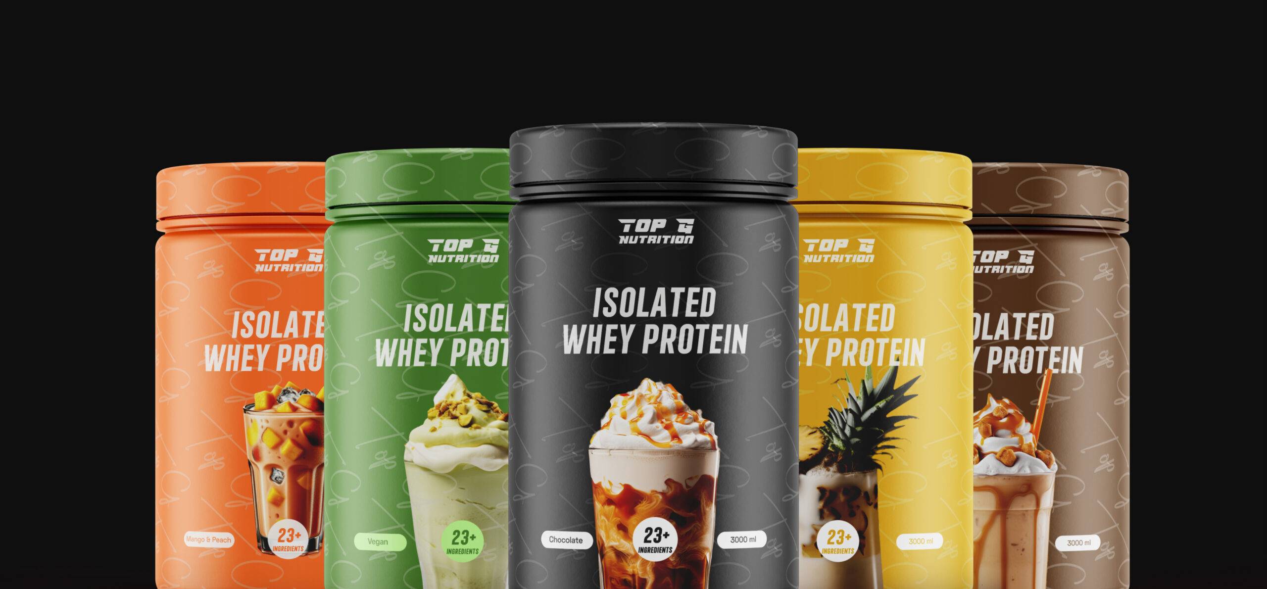
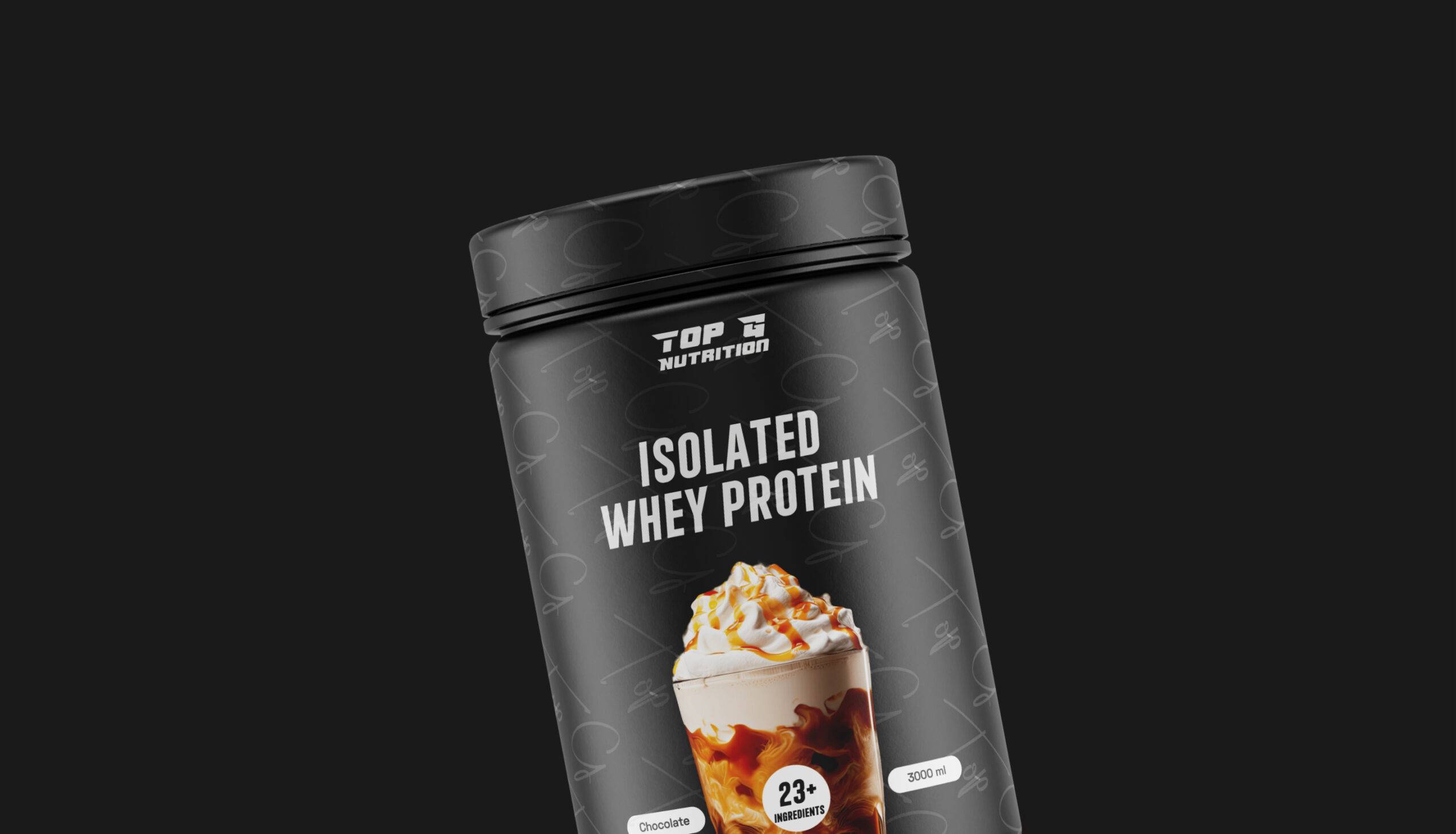
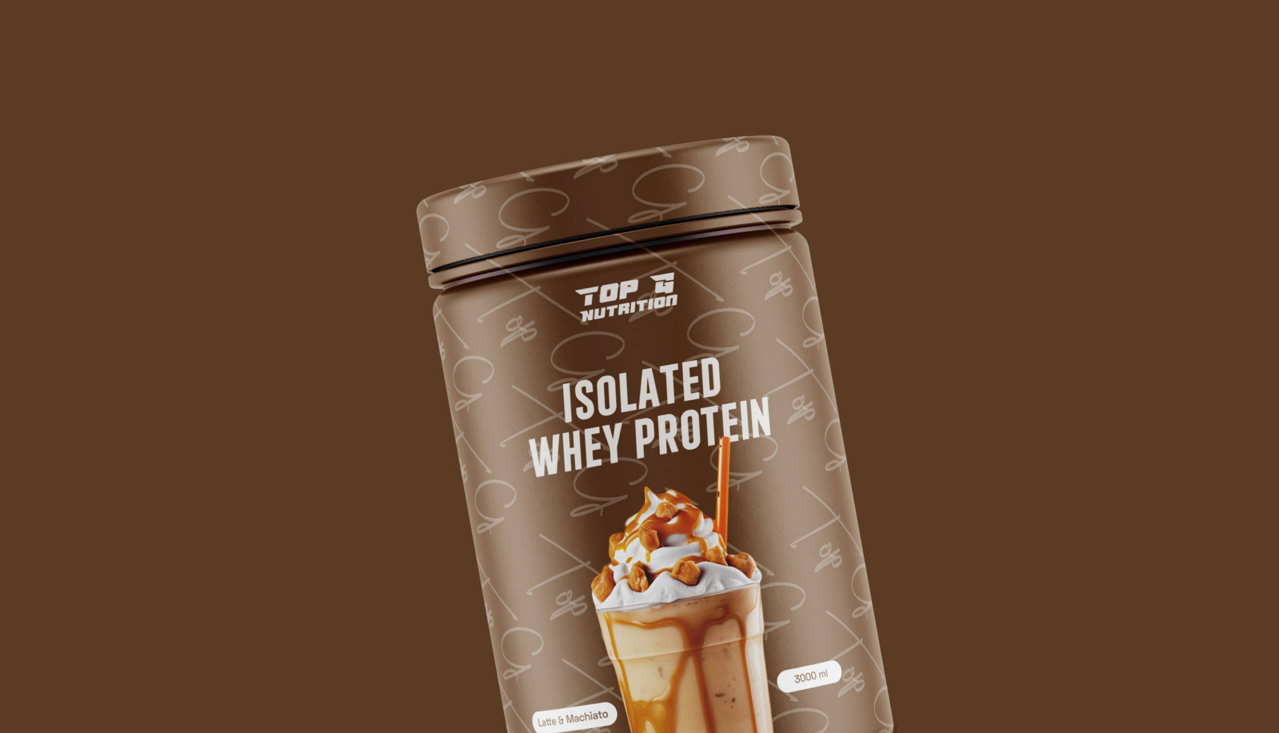
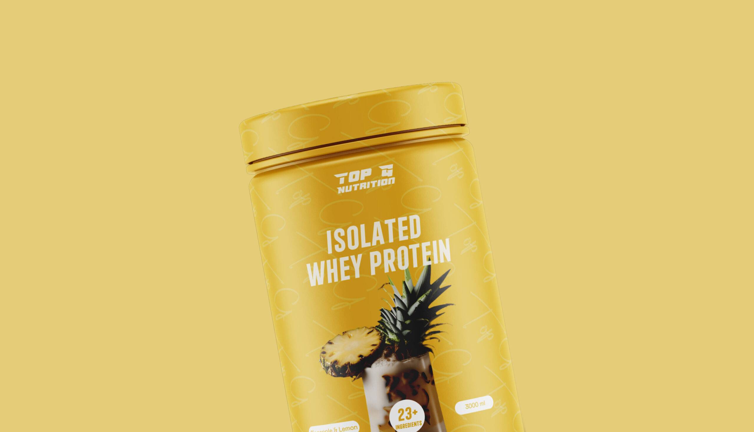
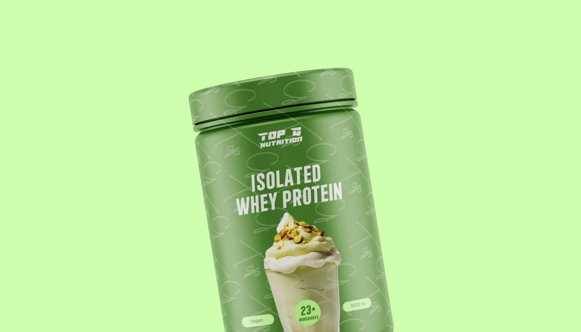
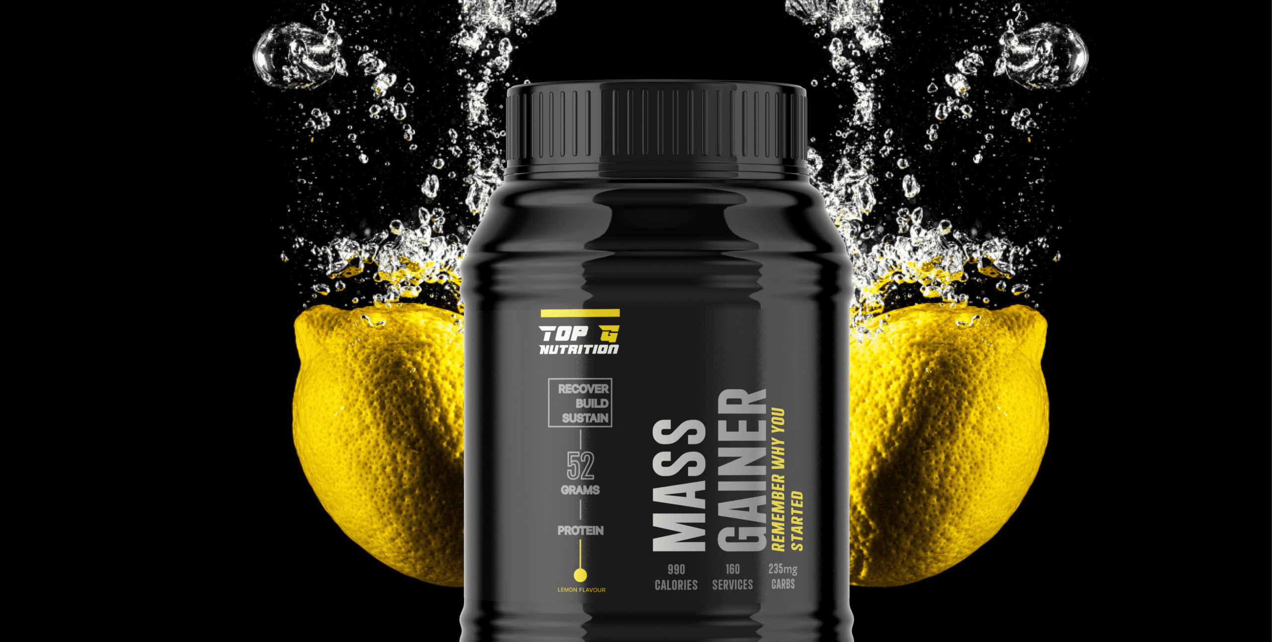
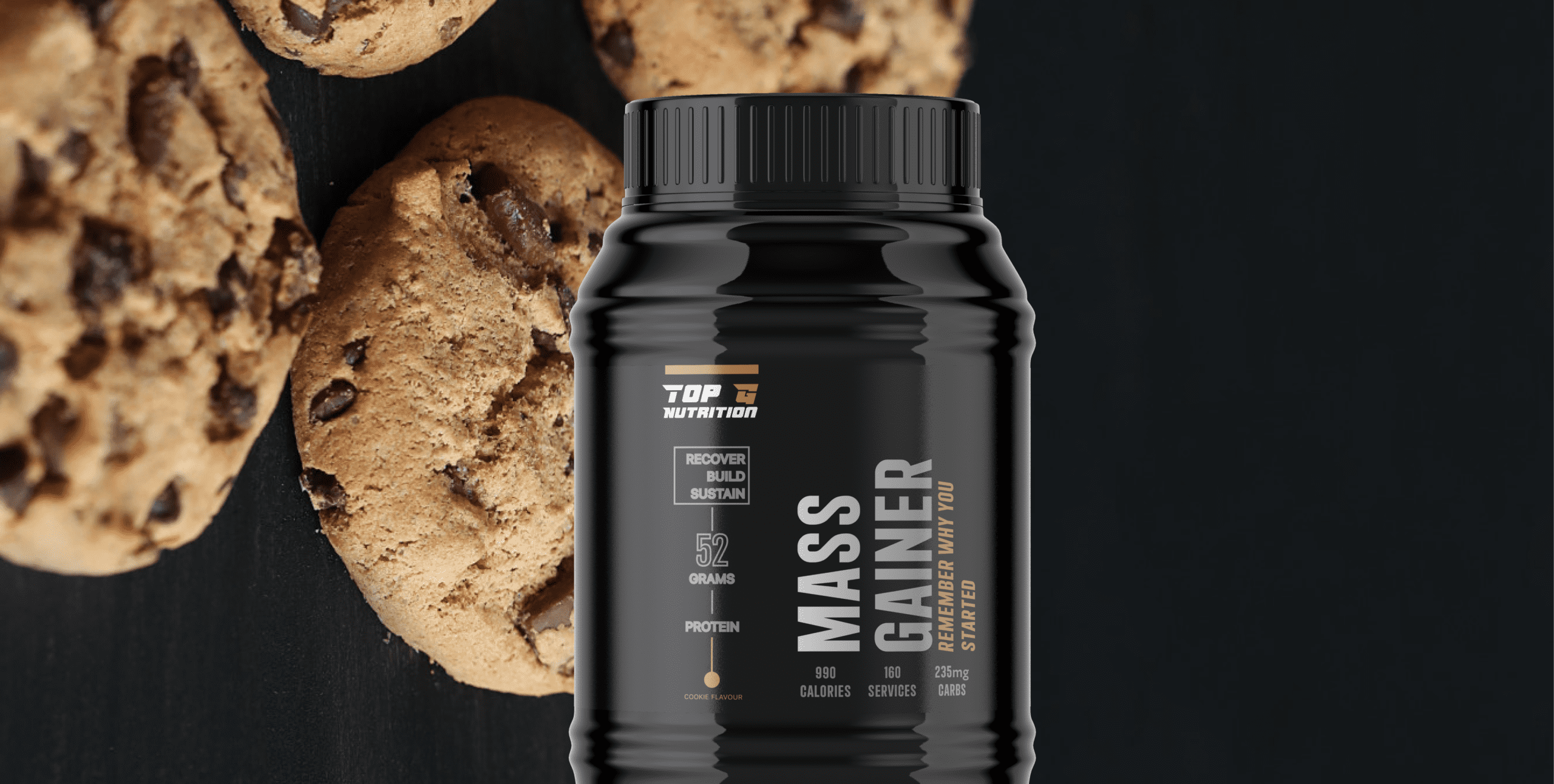
After iterating through seven different versions for our label packaging design, we finalized a version that appeals both to newcomers in the fitness supplement world and to seasoned gym enthusiasts who are long-term users of these products.
The design of our Isolate Protein Shakes is straightforward yet effective, featuring easily recognizable flavors, images of delicious smoothies corresponding to each flavor, and clearly presented information such as weight and ingredients.
Our decision to focus on smoothies stemmed from research indicating that post-gym sessions, individuals are inclined to rehydrate and consume fruit to replenish their protein levels. Hence, we innovatively combined water and fruit into a single, smoothie-based product.
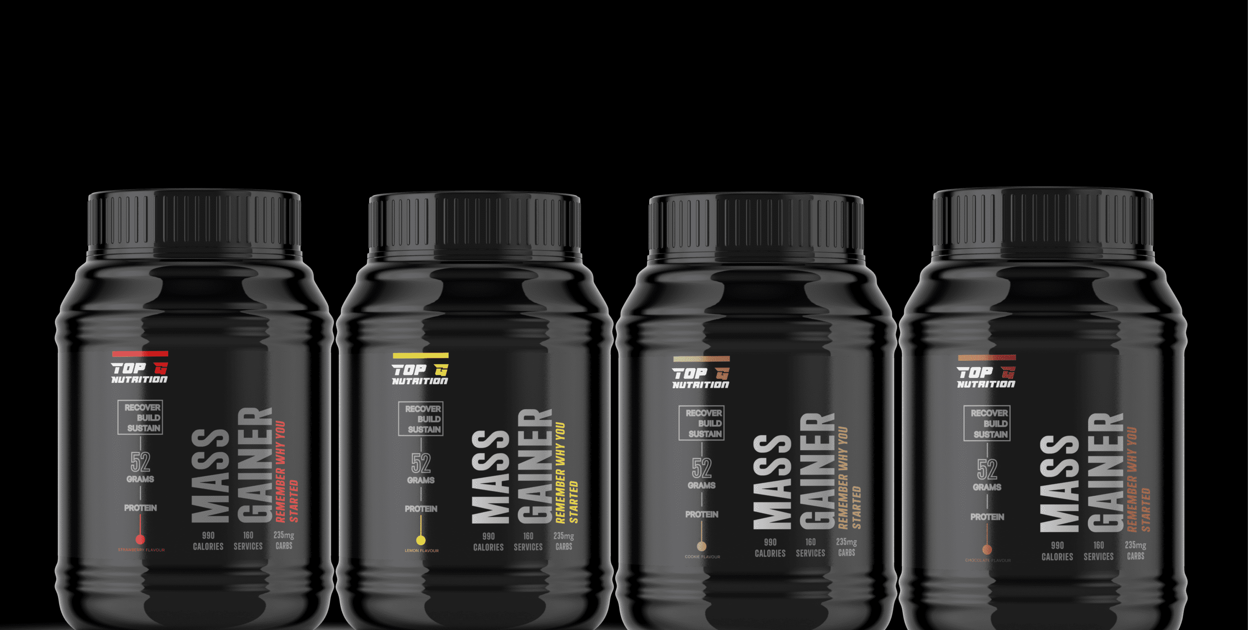
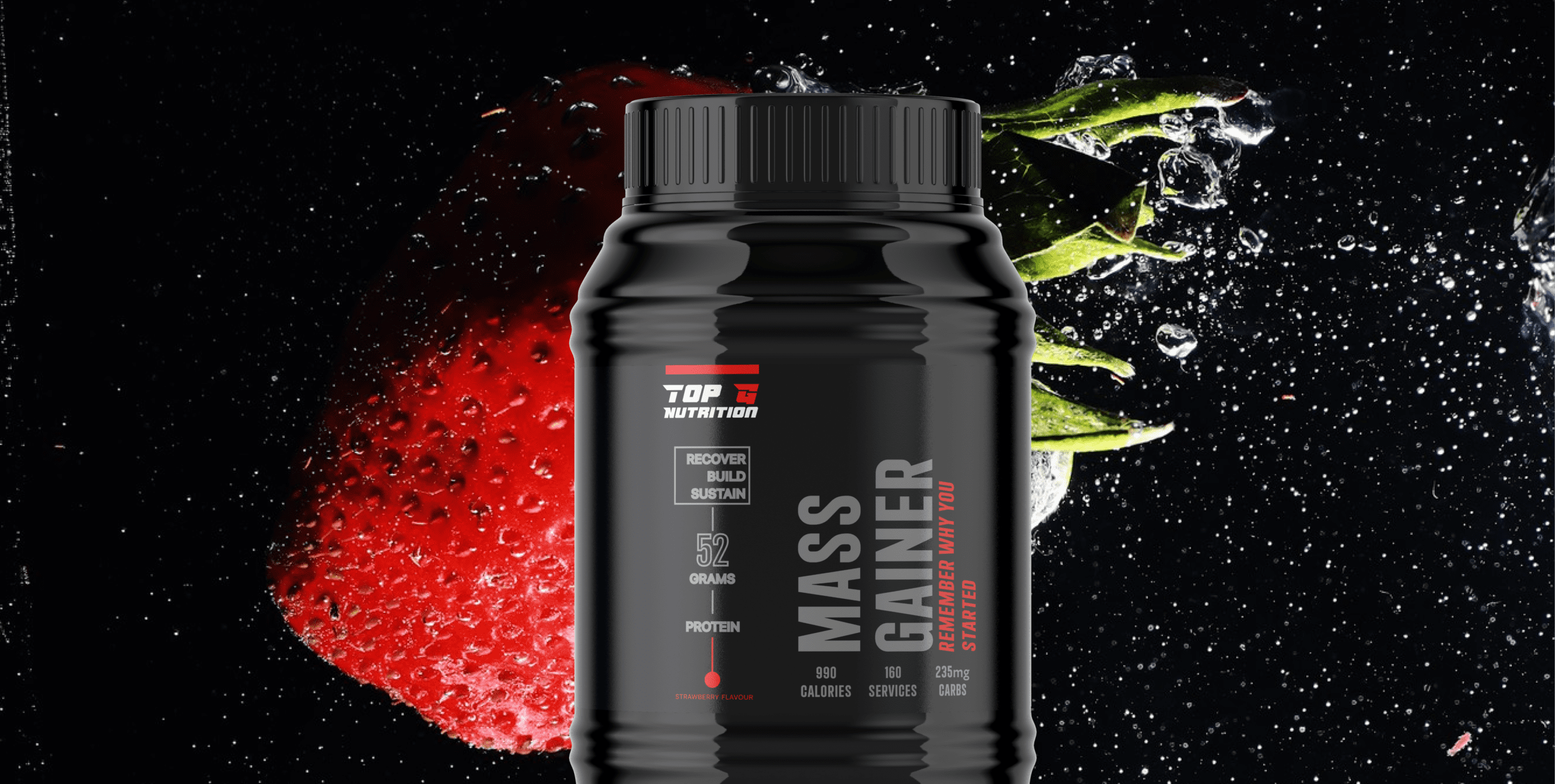
The bottle’s design is not only practical for carrying in a bag but also stylish and uncomplicated, embodying the essence of Top G Nutrition.